Configuration
Install the curacel grow drop-in widget on your website and provide your customers with an option to buy insurance along with the products or services that matters to them.
The Grow widget is fully customizable, and whatever is configured is what the user sees when they launch the widget on your site or app. The customizable features include:
- a Terms and Conditions Page
- an Introduction Message
- a Call to Action Button (with any text of your choice)
- the Background Colour
- the Text Colour
- the Title of your Insurance
- the Insurance Categories you want to display
- the user information details
Now let's walk through the process of configuring the Grow widget to use on your website or mobile app.
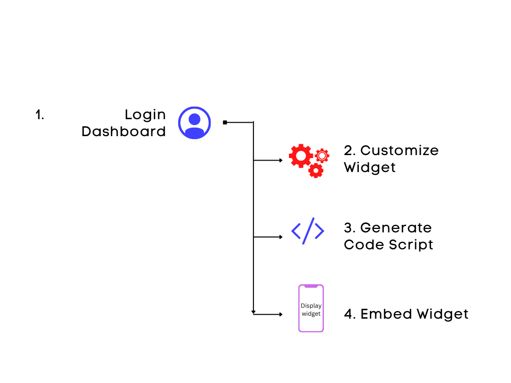
Log in to your Dashboard
In this setting, we are utilizing the Sandbox environment, if you are implementing for production, switch to the Production/Live environment instead.
The first step is to log in to your dashboard using the link provided to you during sign-up. On your dashboard, click on Widget in the left-hand menu.
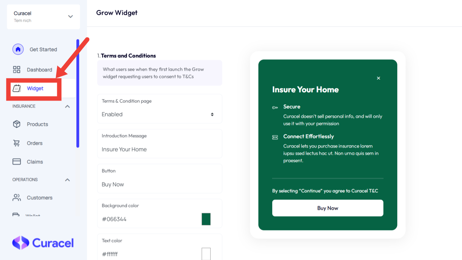
As stated earlier, there are a number of customizable options on the widget dashboard, which you can modify to suit your business interface. The widget is divided into three main sections according to the steps the user would take.
1. Introductory Section
This section involves the first display the user sees when they launch the widget. The following parts are customizable in this section:
Terms and Conditions
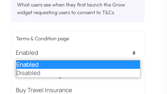
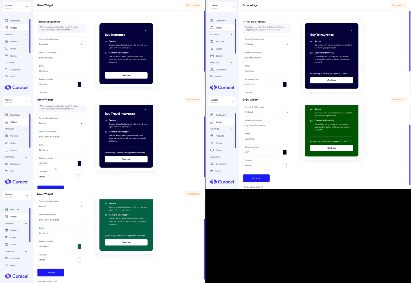
You can enable or disable this feature from the dropdown at the left-hand menu. If enabled, the user consents to it before proceeding to the next section.
Introduction & Button Message
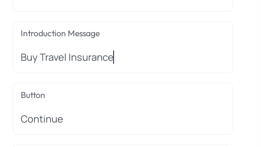
On the textbox at the left-hand menu, you can type any text as your introduction message to the user when the widget is launched. In addition to that, the button to the next section can be filled with any text of your choice as well.
Text & Background Colour
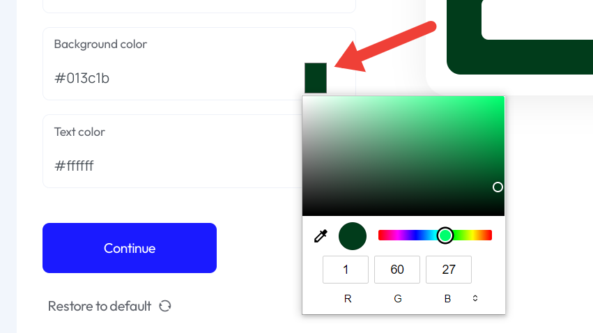
The background and text colour of the widget can be set to any colour you want by either typing out the colour name/hex code or clicking the square button to select a range of colours from the colour picker pop-up.
Below is a full illustration of customizing your introductory section of the widget.
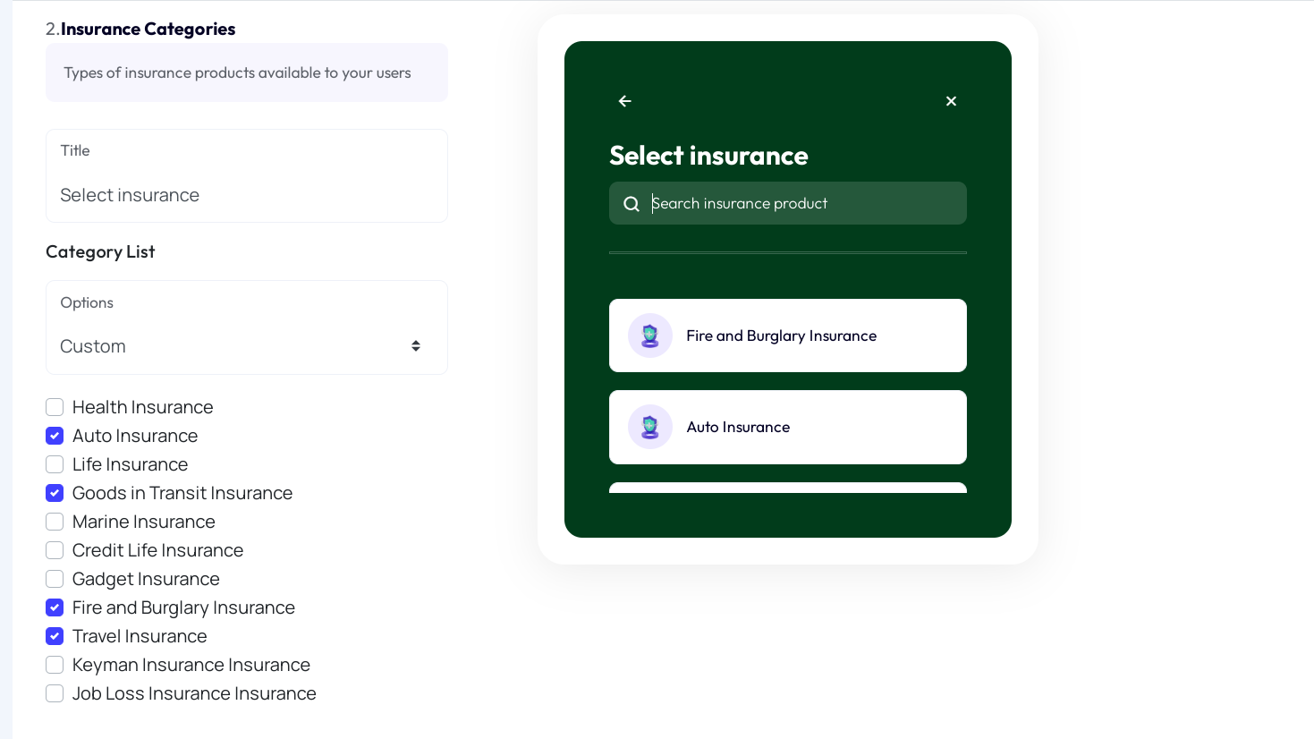
2. Insurance Categories Section
This section shows you the type of products available to show to your users via the widget. A text input allows you to type a title message.
Here you can list out the insurance products you want to offer to your customers/users via the widget. You have the option of listing all insurance categories or clicking the checkboxes to select the ones you want to display.
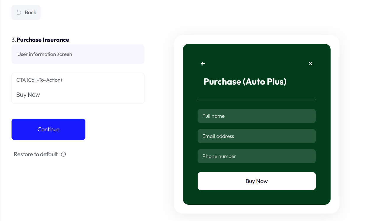
3. Purchase Insurance Section
This section is the final section before the user purchases the selected insurance product. It consists of a form containing name, email and phone number input fields. Finally, you can edit the text on the Call-to-Action button using the text box at the left-hand menu.
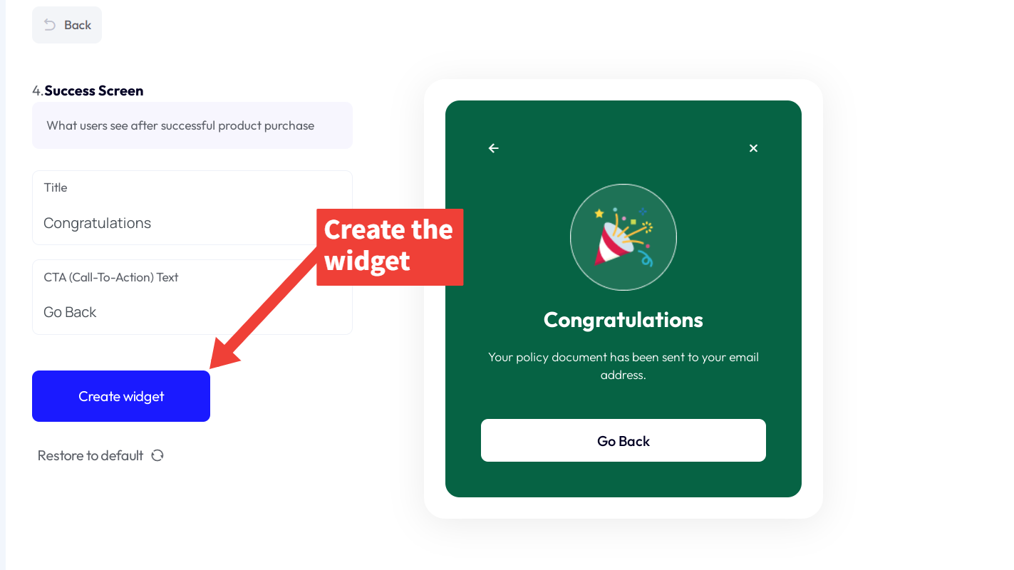
4. Success Screen Section
This is the part of the widget the user sees after successfully purchasing an insurance product. As with the previous sections, there are input fields for writing any text for both the Title text and Call-to-Action button respectively.
5. Generate Widget Code Script Snippet
Now that you have done the necessary configuration of your widget, the next step is to embed it on your website or app. To do this, click on the blue Create widget button, as illustrated in the image above. This will generate a code snippet containing a script tag. Copy the code script below into the <head/> section of your HTML file.
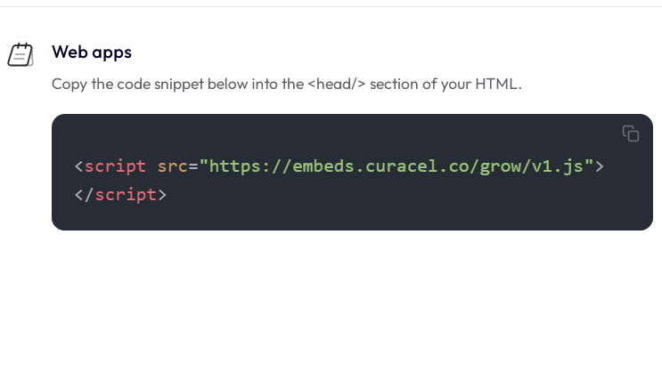
With the widget loader script copied, the next step is to connect the widget to your website. Head on to the Embed Widget section.